Time is money! Don’t waste any, and take a look at our brand usage guidelines before you put our assets to work.
Give our brand the respect it deserves – if you’re ever in doubt, don’t hesitate to drop us a line!
Our logo is an important asset to our organisation and should serve as a foundation for all visual communications.The identity can only make a positive impact if used consistently and correctly throughout all brand communications.To maintain a strong brand image it is important that the logo is always applied consistently wherever it appears. It should never be manipulated or distorted. Its colour, position and size are all specified on this page.
The logo can be used in black on light backgrounds, or white on dark backgrounds, or in contrasting brand colours.
You should use the official primary logo of Aktiva Finance Group in most instances related to this brand. Our logo depicts a colourful letter A that also represents a mountain. The meaning behind our logo comes from our mission to help our partners conquer new heights and achieve success. The Aktiva Finance Group logo is a symbolic representation of the brand. The position and proportions of the logo are strictly fixed. You should not alter it in any way under any circumstances.
The secondary logo highlights the logo’s versatility making it easy to use in smaller spaces.
The Aktiva Finance Group’s secondary logo is a symbolic representation of the brand.
It should not be altered in any way under any circumstances.


Our logomark is vibrant, minimal, premium, and timeless.
The logomark can only be used alone in social media profile pictures, app icons, favicons, and photographs or slides where the full logo has been previously used. Please contact us for any other use of the logomark.
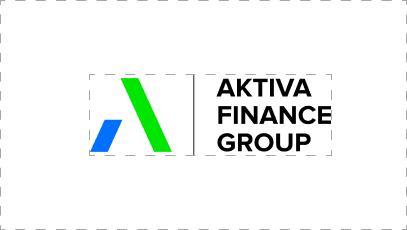
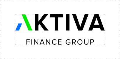
The exclusion zone is essential to clearly distinguish the logo from other graphic elements. Please avoid positioning elements closer than the defined exclusion zone. The exclusion zone for our logo is the width of the logomark on each side for the logomark and primary logo. When using the secondary logo, it’s the width of the secondary logo’s mark on each side. When in doubt, leave more space.
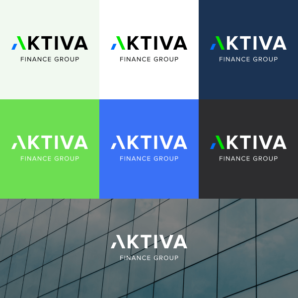
Where possible, use the logo on a white, Blue Crayola, Prussian Blue, Malachite, Jet Black, or dark background to keep brand recognition high. With any other colors choose the logo that stands out from the background the most. Place the logo in less crowded or busy areas of any visual. If it’s not possible to use the primary logo, try to use the white or black variations to have contrast. Always prefer the Primary or Secondary logo instead of only the mark.
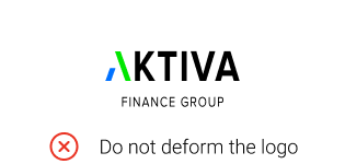
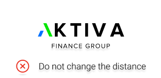
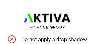
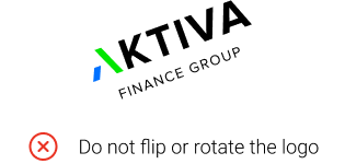
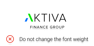
To preserve the logo’s integrity, please avoid executions that misuse, amend or trivialize the identity of our brand. Here are some examples of what not to do. If you’re ever in doubt, please come back to this page


Aktiva Finance Group is the parent company of many successful businesses. To create a stronger sense of unity, you should always use the Aktiva Finance Group logo with the subbrand’s logos. The Aktiva Finance Group logo is added as a very small compliment piece under the subbrand logo.
You should not crop and add the logos yourself but only use the ones presented in the brand book.
Still have questions about using our brand?
© 2023 Aktiva Finance Group. Privacy Policy and use of cookie